Hi team
I noticed:
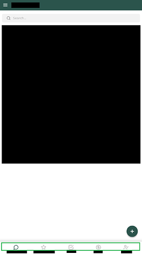
- mobile view: allows 5 screen options at the bottom bar, and the rest within the menu button dropdown
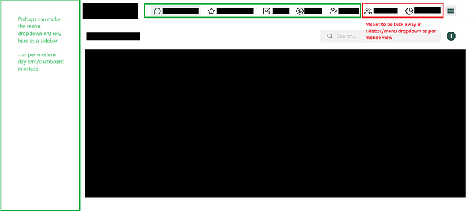
- desktop view: allows 7 screen options at the top bar, and the rest within the menu button dropdown
If the intention is to be consistent in both interface experience, perhaps we can standardise 5 screens @ mobile bottom bar = 5 screens @ desktop top bar?
Otherwise the excess 2 screens in the desktop top bar, that were supposed to be in the mobile menu button dropdown, may appear weird to co-mingle with the ones that had been in the mobile view bottom bar - coming from the perspective where there’s different design intentions for deciding what is sticky visible and what’s not for user experience in the first place.
Mobile view:
VS
Desktop view:
Imo, either be consistent in this manner OR allow separate configuration of mobile and desktop view would be better forward.
/////////////
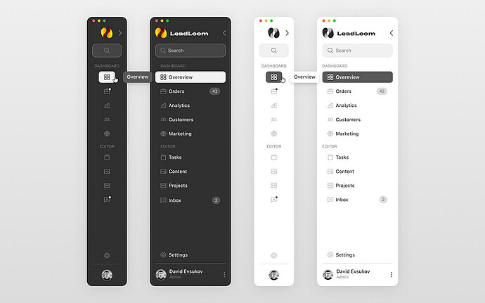
Not withstanding the above, for the desktop’s menu button dropdown, perhaps this can be converted into a sidebar? It’s counterintuitive interacting with a menu button dropdown in desktop view. I think having it shown as a full fledged sidebar (with the option to collapse/minimise) will greatly improve the user experience + utility value of the desktop view
An example:


