Is there a way to wrap the text in the filters so that longer text does not cut off? Also in titles. I am creating a website from a database and I have attached screenshots of the filter text being cut off. I am trying to filter the database and use buttons and more interactive features to make the database more accessible to the public via NotionApps and it would be very helpful if they could see the whole question (text). What would be even more helpful is if I could create interactive buttons for each of the filters (questions in this case) that would take them to another page with only those filters applied to the whole database.
You can get close with the current settings, but there are two different things happening in your example.
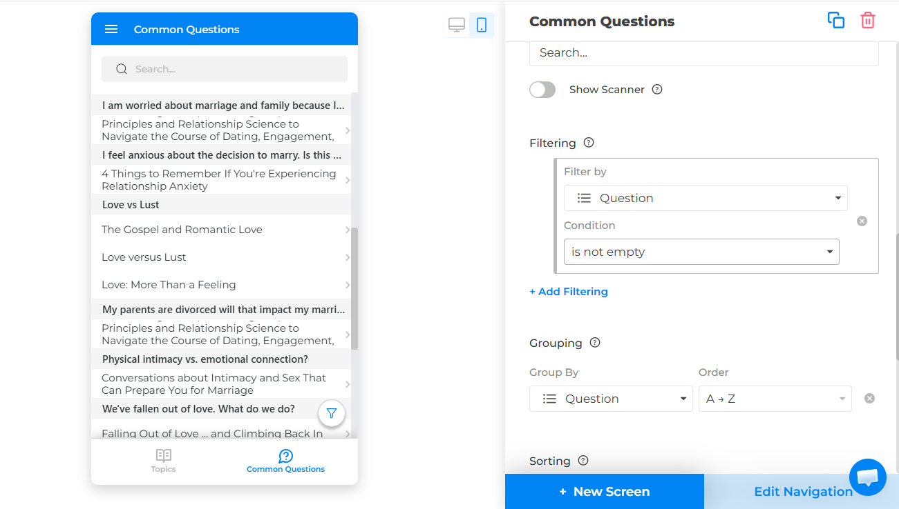
On the Common Questions screen, it looks like the list is currently grouped by Question. Group headers are single-line right now, so long questions there can get cut off. To make the full question easier to read, I’d suggest this setup:
- Open the Common Questions screen in the builder.
- In the right panel, remove Grouping by Question or change grouping to a shorter field like Category, Media Type, or a new Topic field.
- Under the list’s data/display settings, set the Title field to Question.
- If the screen is in List view, turn on Expanded View.
- Turn on Wrap Text.
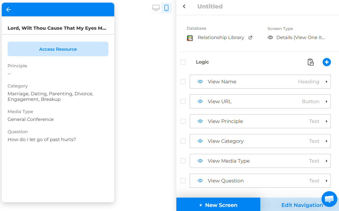
That should help the question text wrap in the list rows. The filter popup labels and top navigation/detail-page title still do not wrap, so for those I’d use shorter labels like a Short Question or Topic field, then show the full question inside the detail page body using your existing View Question text component.
For the button idea, the current workaround is to create pre-filtered screens:
- Create a new list screen, for example Marriage & Family Questions.
- Use the same Relationship Library database.
- Add a filter such as Category contains Marriage or Question contains [specific phrase].
- Create a main/index screen with buttons like Marriage & Family, Love vs Lust, Dating, etc.
- For each button, set the action to Go to Screen and choose the matching filtered screen.
So it is possible to create button-based paths into filtered database views, but each button needs its own destination screen with its own saved filter.
1 Like
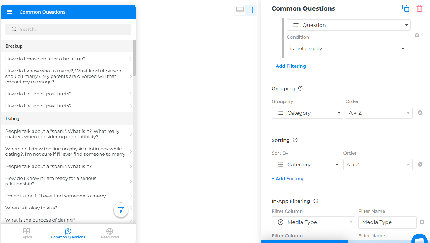
Thank you for your reply Linzie! Unfortunately I was unable to make the first suggestions work properly. I will share a screenshot. Firstly, I want the title of the resources to be what users see. Second, because I have items in the database with multiple questions attached to them and some with no questions (I am using a multiselect property), if I do anything other than group, I run into a couple of problems. First, all of the questions will appear underneath the title or will be in the title. I just want one of the questions to be shown if there are multiple. Grouping works the best for this because it hides the questions themselves. Next, because there are multiple different resources all labeled with the same question, without the title being the largest text, it becomes confusing on the screen with lots of text being shown (both questions and titles). I can see about shrinking the length of the questions themselves and that will be the next thing I try. If it were possible, I just think a simple wrap text option for the groups would be simple enough, but I am unsure how hard that would be to add.
Hi RomajiMaster,
Thank you for the screenshot and the extra explanation. That makes the use case much clearer.
You are right: in your setup, grouping by the Question multiselect makes the most sense because it keeps the resource title as the main row text and avoids showing every attached question inside each list item. The limitation you’re running into is that group headers currently do not have their own Wrap Text option, so long group names/questions can be cut off.
At the moment, the best workaround would be to use a shorter grouping value while still showing the full question elsewhere. For example, you could add a Short Question or Topic multiselect property with shorter labels, group the screen by that field, and keep the actual resource title as the list title. Then on the detail page, you can still show the full question using your existing text component.
So the structure would be something like:
- List title: Resource title
- Group by: Short Question / Topic
- Detail page: Full question text
For resources with no questions, your current Question is not empty filter is still the right way to keep them out of this Common Questions view.
That said, I agree with you that a Wrap Text option for group headers would be the cleanest solution here. I’ll pass this along as a feature request, because your setup is a good example of where that would be useful.
Additionally, in the upcoming release you can use embedded JavaScript. Once that update is available, you may be able to add a small custom script to adjust the styling of the group headers directly in the app. In your case, the goal would be to make the grouped question labels behave like wrapped text instead of a single truncated line.
Conceptually, the script would do something like:
`const style = document.createElement("style”);
style.innerHTML = /* Group header text */ .group-header, .list-group-header, [class*="group"] { white-space: normal !important; overflow: visible !important; text-overflow: unset !important; line-height: 1.3 !important; height: auto !important; min-height: 36px !important; };
document.head.appendChild(style);`
The exact class names may be different, so this would need to be adjusted once the embedded JavaScript feature is released and we can inspect the live app structure. But the idea is simple: keep your current database setup, keep grouping by Question, keep the resource title as the main row title, and use embedded JavaScript/CSS to make only the group headers wrap.
So this would not require changing your data structure or splitting questions into separate screens. It would be more of a visual customization layer for the grouped list display.